


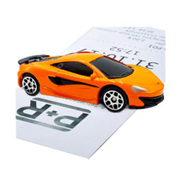


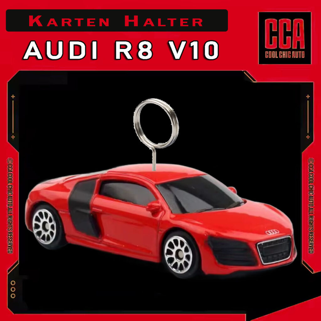

Audi R8 V10 – Kartenhalter
Ausführung wählen
Dieses Produkt weist mehrere Varianten auf. Die Optionen können auf der Produktseite gewählt werden

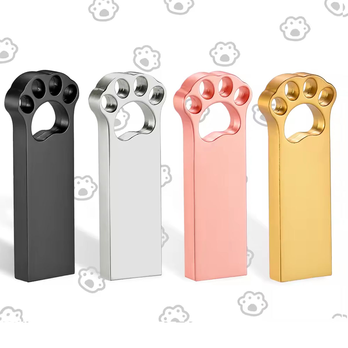
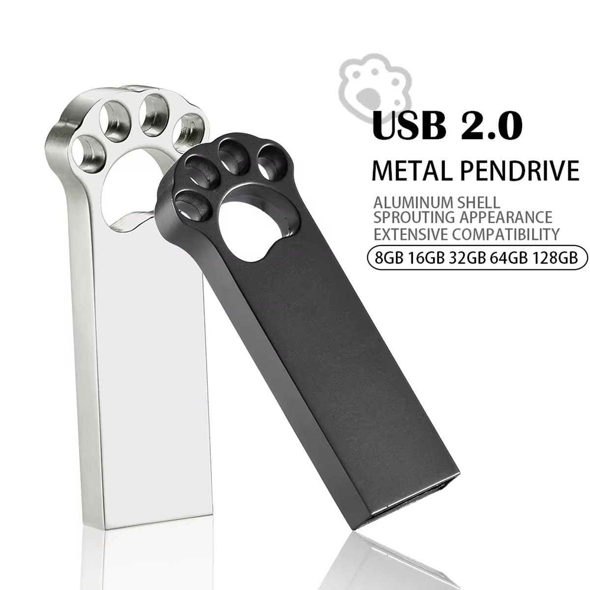
Bärentatze metall – Flash Drive 16 GB
Ausführung wählen
Dieses Produkt weist mehrere Varianten auf. Die Optionen können auf der Produktseite gewählt werden
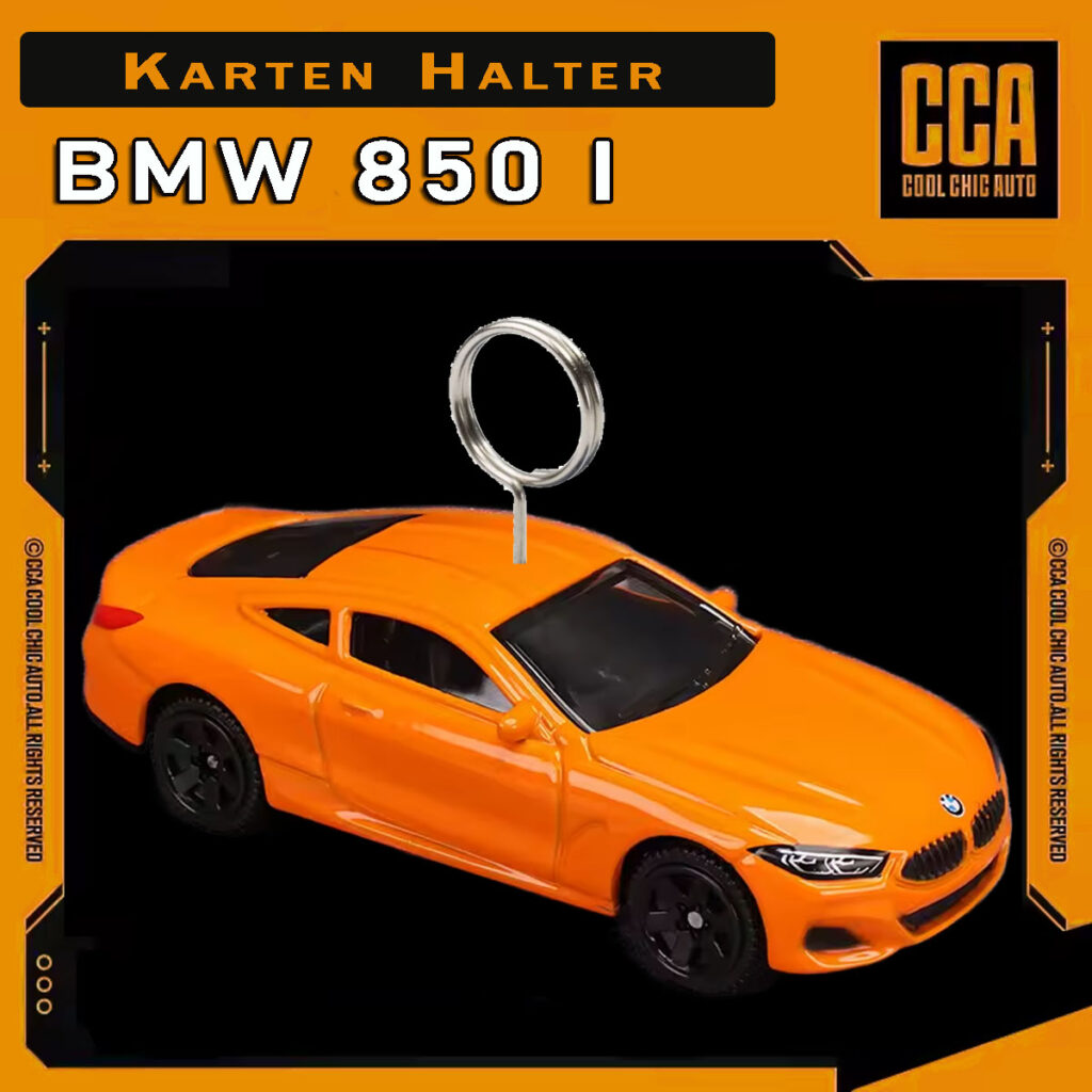
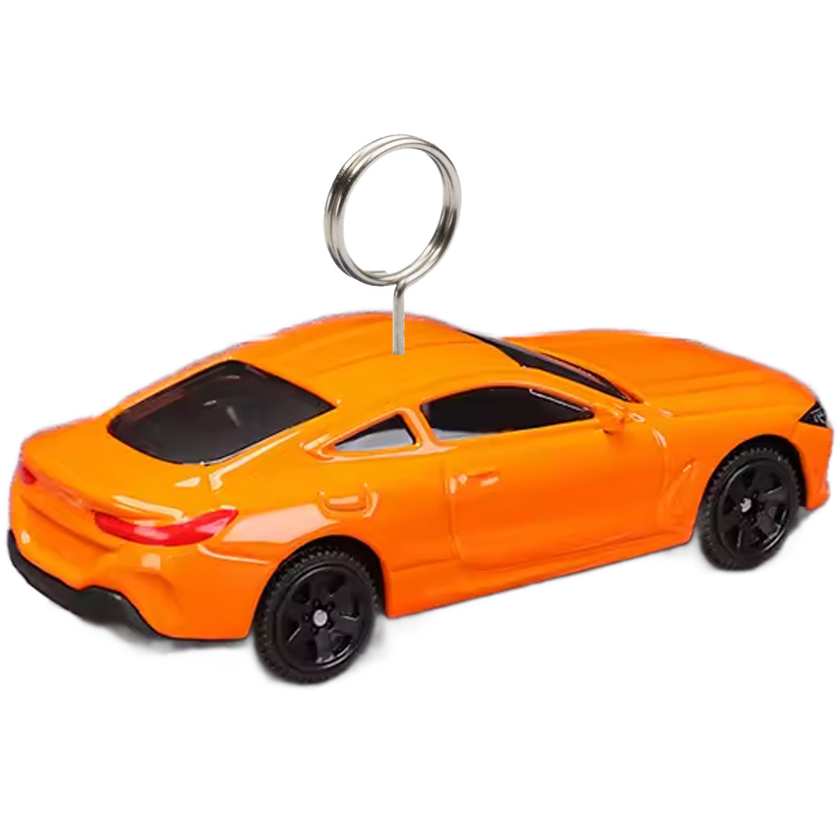
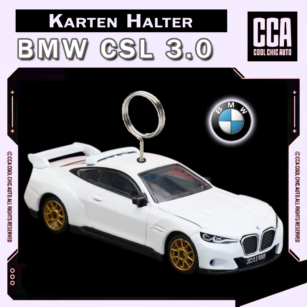
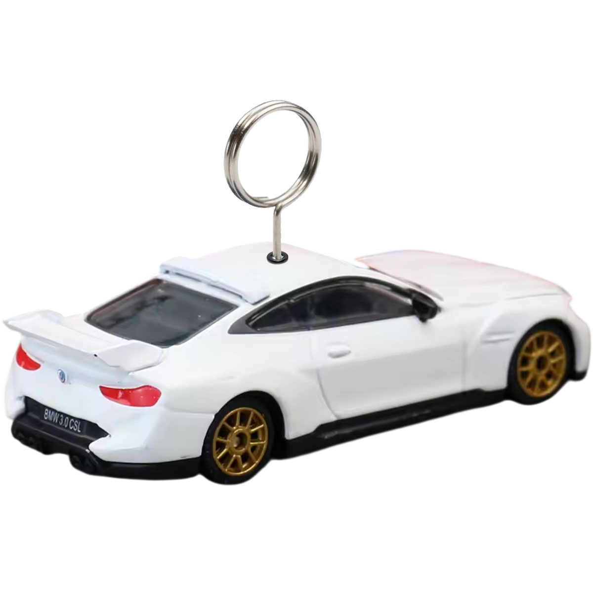
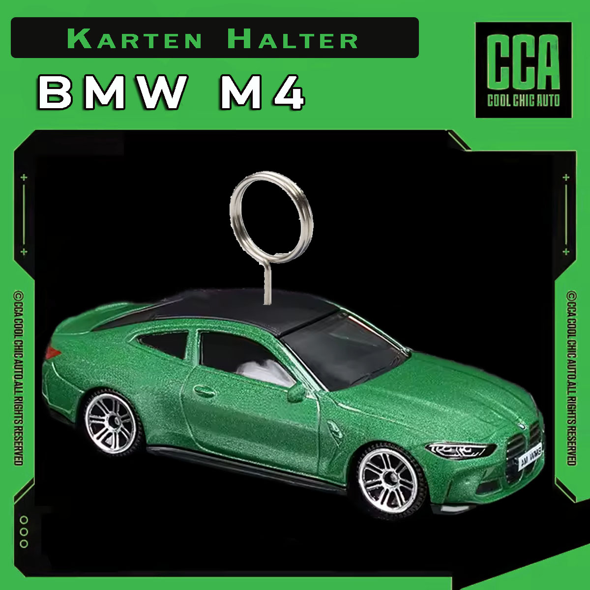
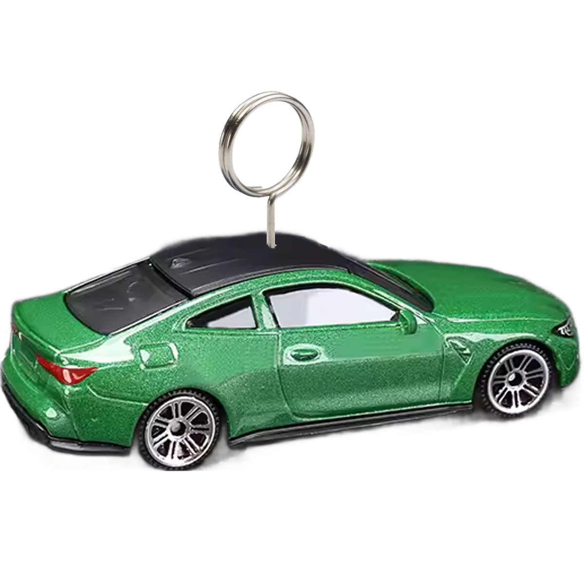
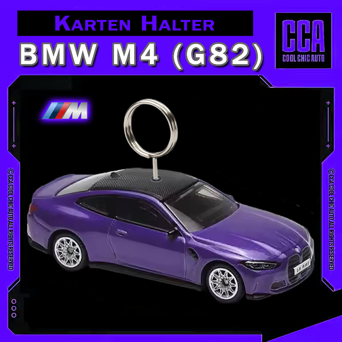
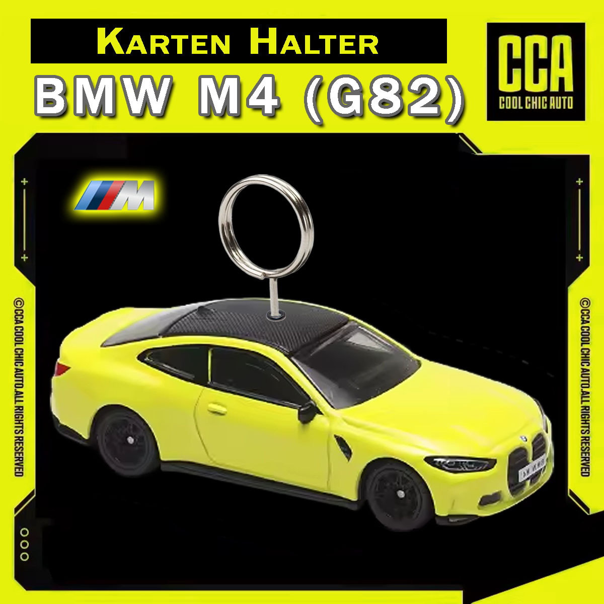
BMW M4 (G82) – Kartenhalter
Ausführung wählen
Dieses Produkt weist mehrere Varianten auf. Die Optionen können auf der Produktseite gewählt werden
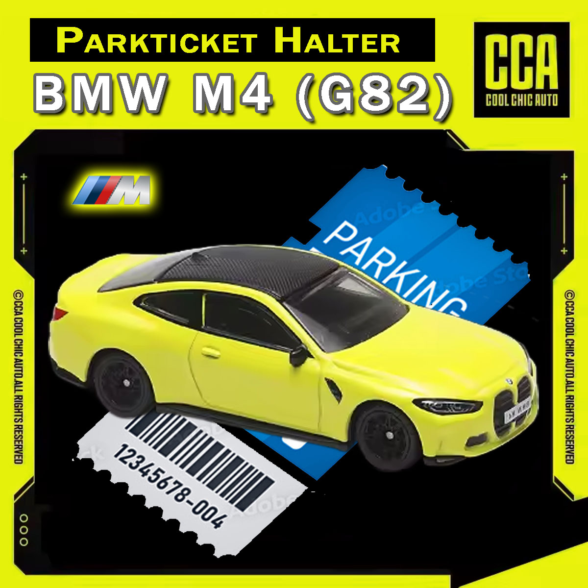
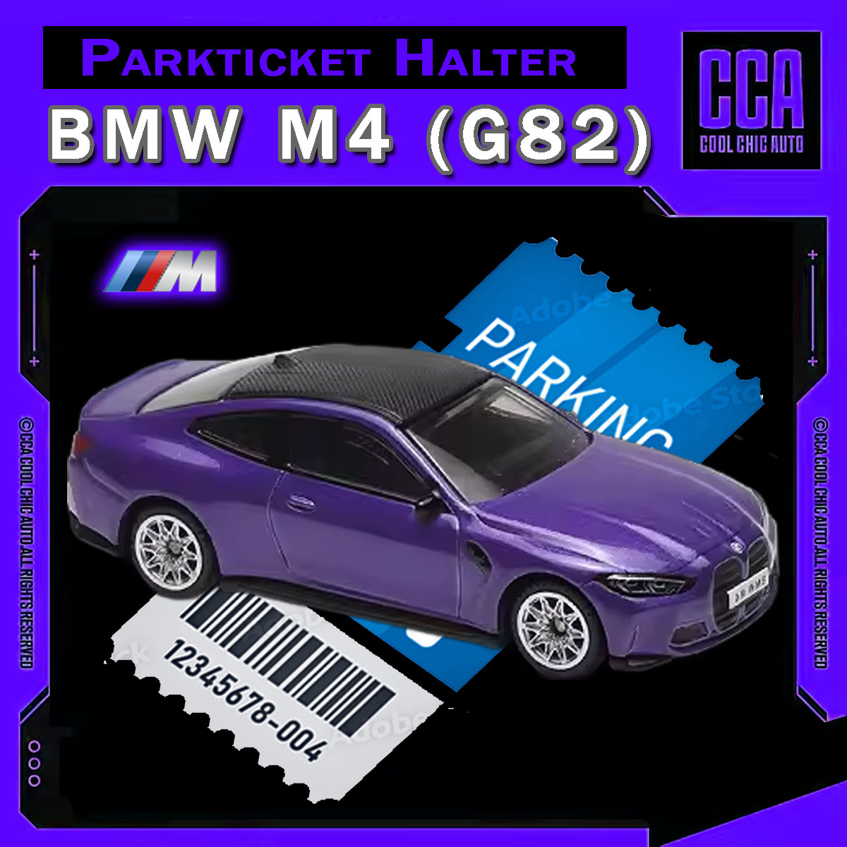
BMW M4 (G82) – Parkscheinhalter
Ausführung wählen
Dieses Produkt weist mehrere Varianten auf. Die Optionen können auf der Produktseite gewählt werden
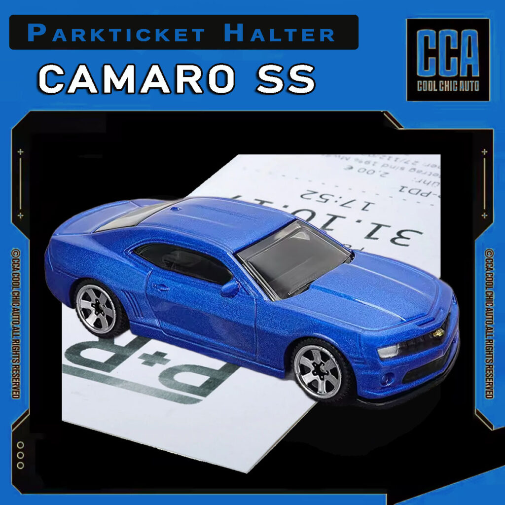
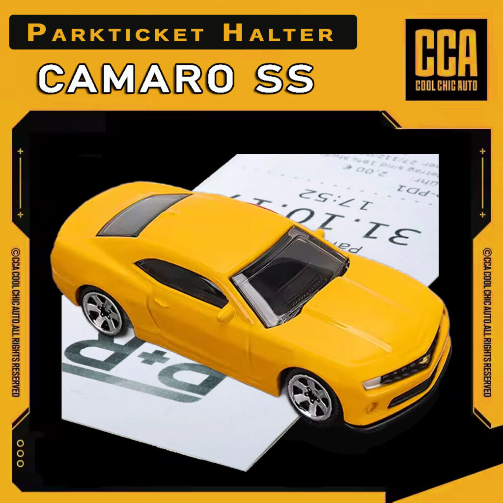
Camaro SS – Parkscheinhalter
Ausführung wählen
Dieses Produkt weist mehrere Varianten auf. Die Optionen können auf der Produktseite gewählt werden
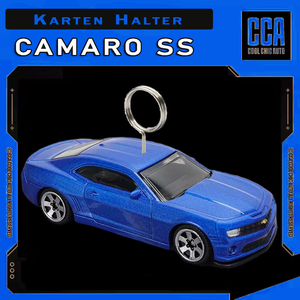
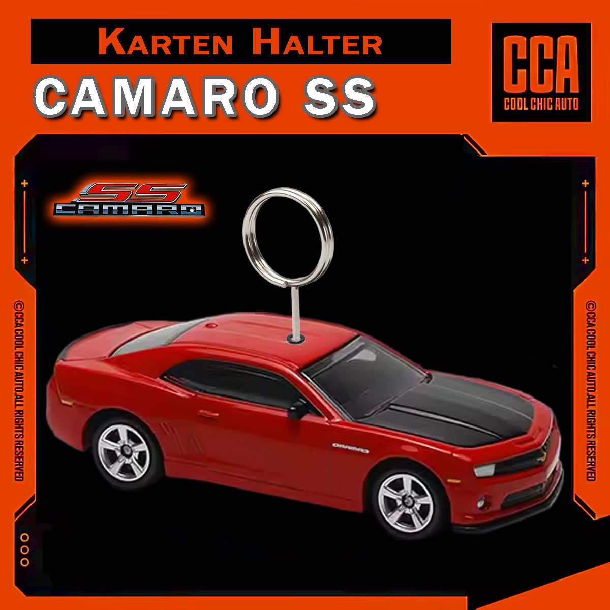
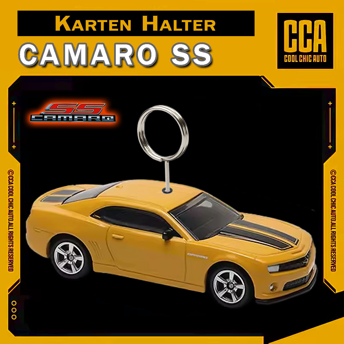
Chevy Camaro SS – Kartenhalter
Ausführung wählen
Dieses Produkt weist mehrere Varianten auf. Die Optionen können auf der Produktseite gewählt werden
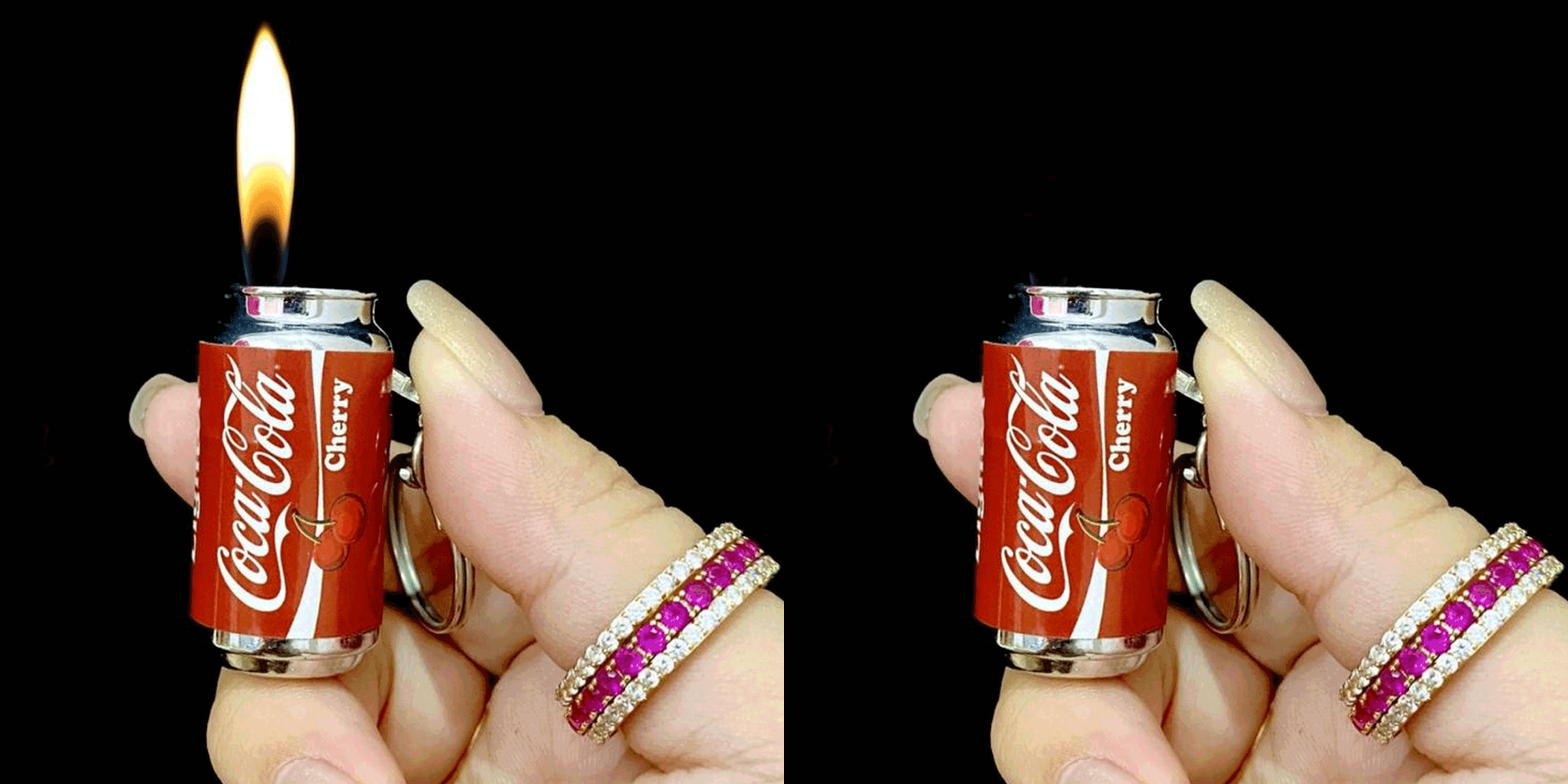
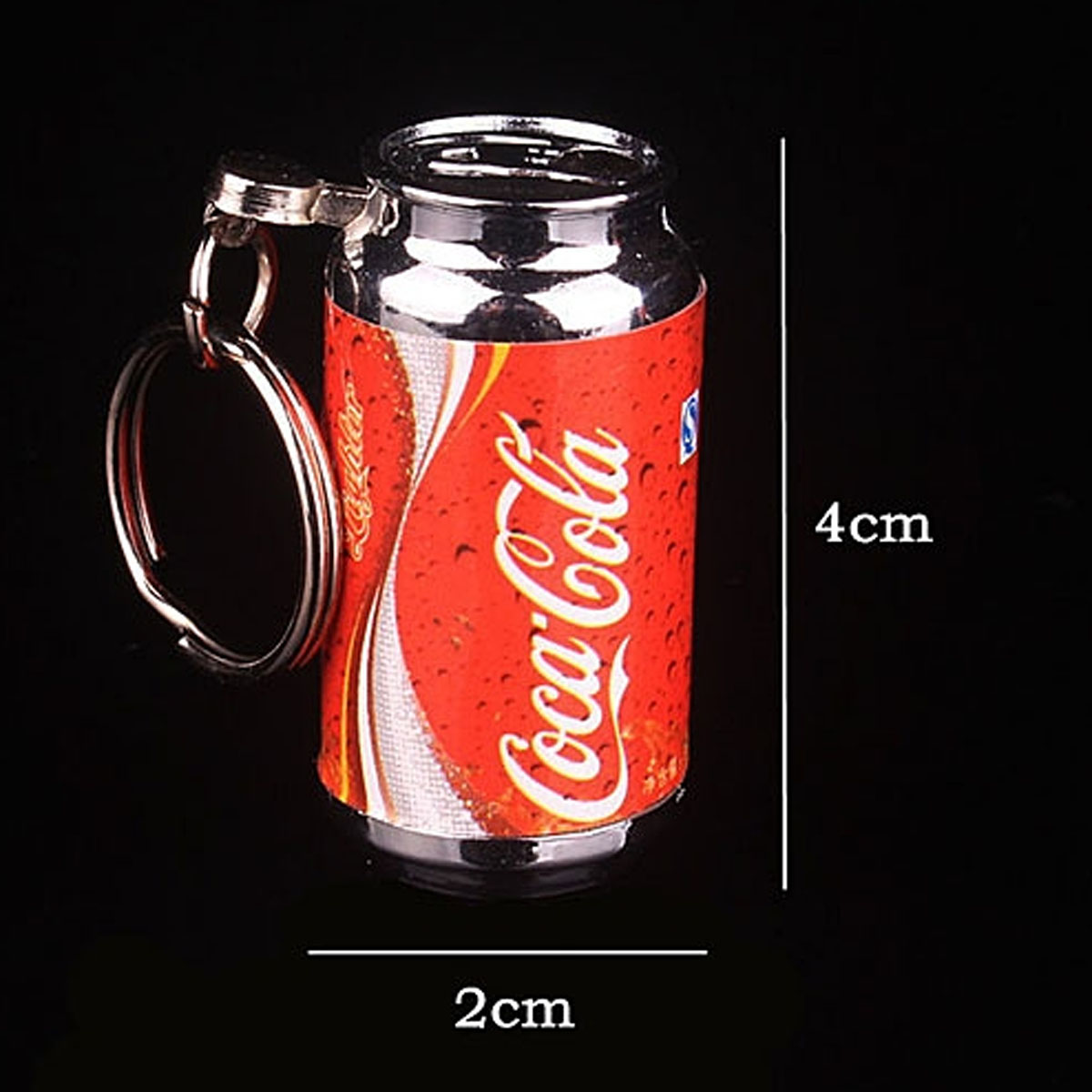
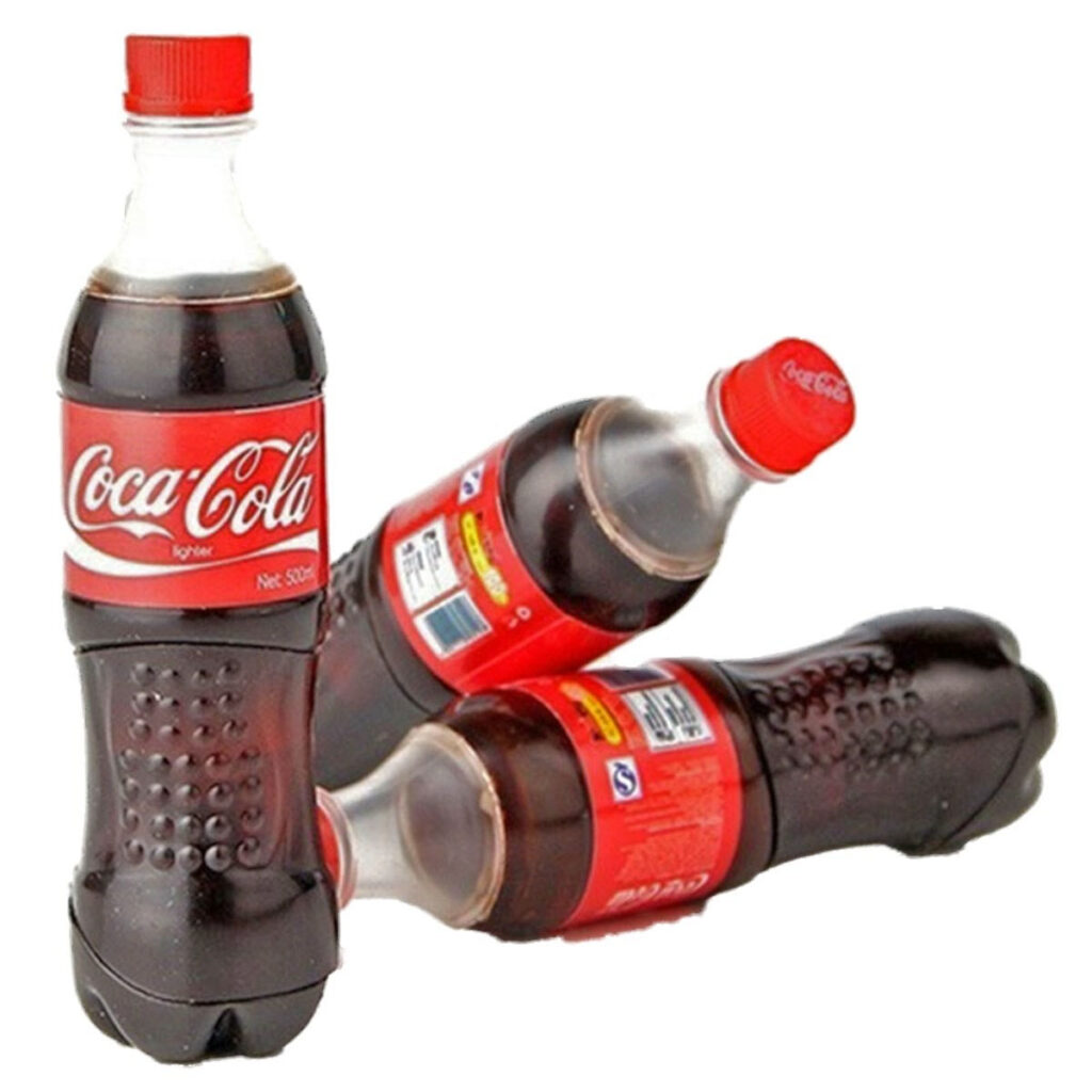
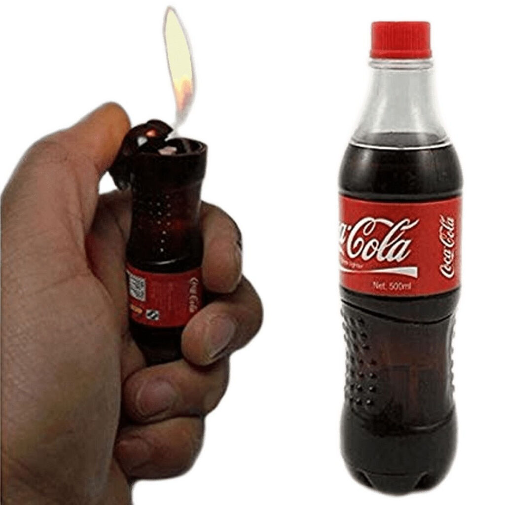
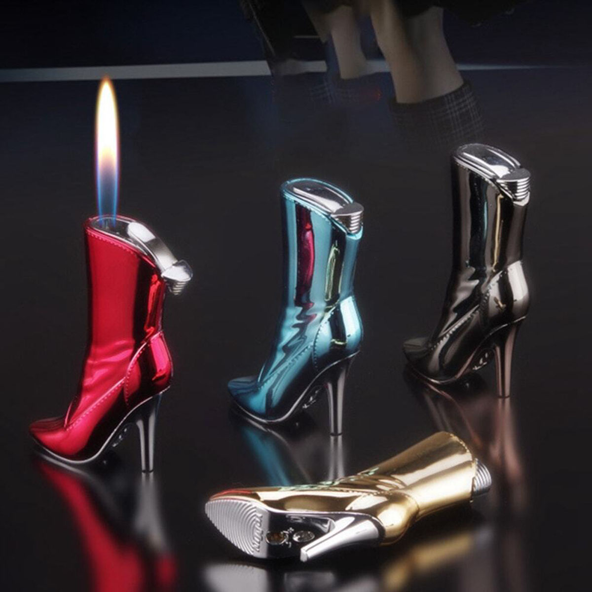
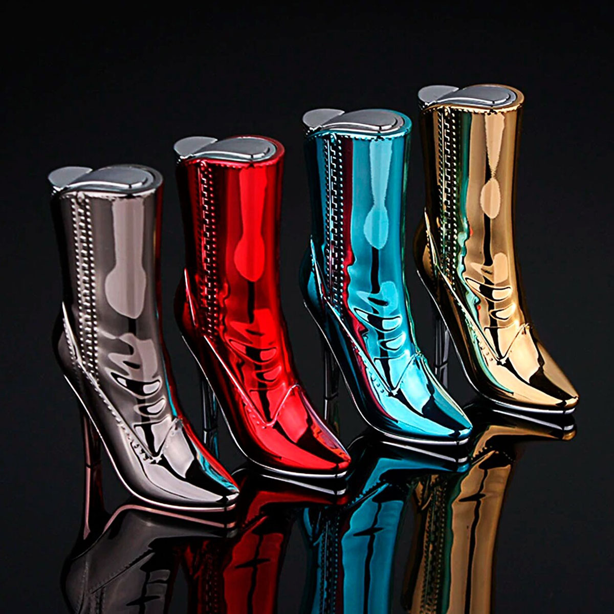
Damen Schuh Stiefelette – Gas Feuerzeug
Ausführung wählen
Dieses Produkt weist mehrere Varianten auf. Die Optionen können auf der Produktseite gewählt werden

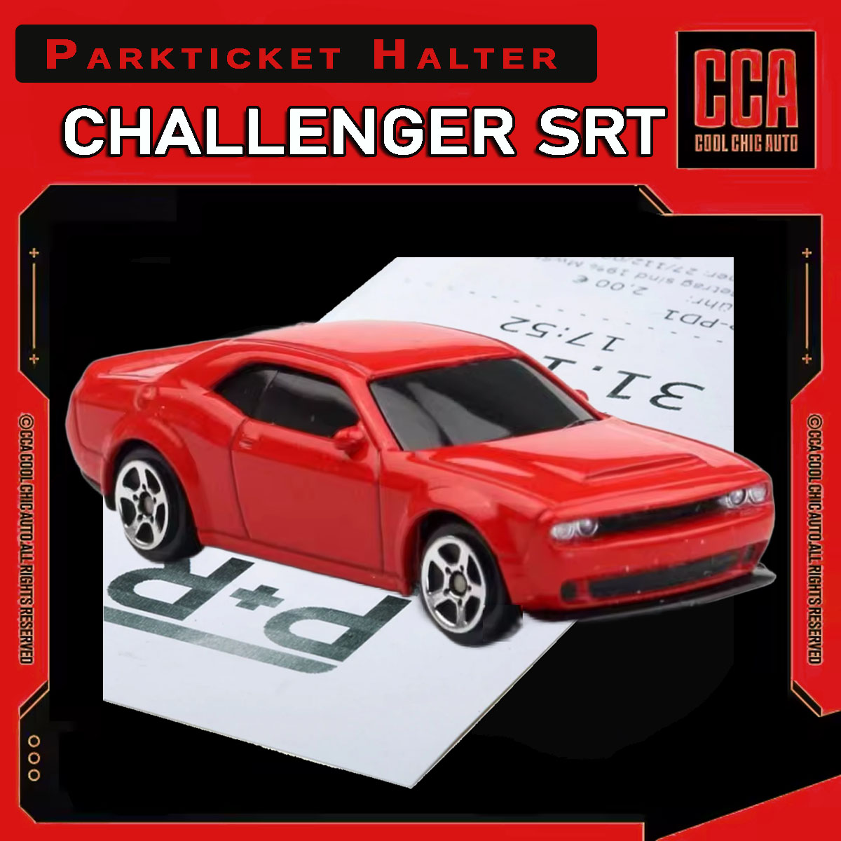
Dodge Challenger SRT – Parkscheinhalter
Ausführung wählen
Dieses Produkt weist mehrere Varianten auf. Die Optionen können auf der Produktseite gewählt werden
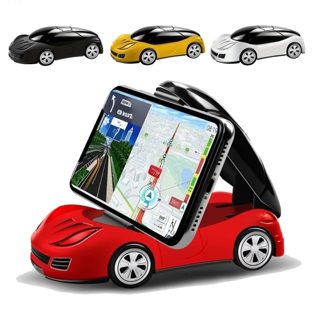
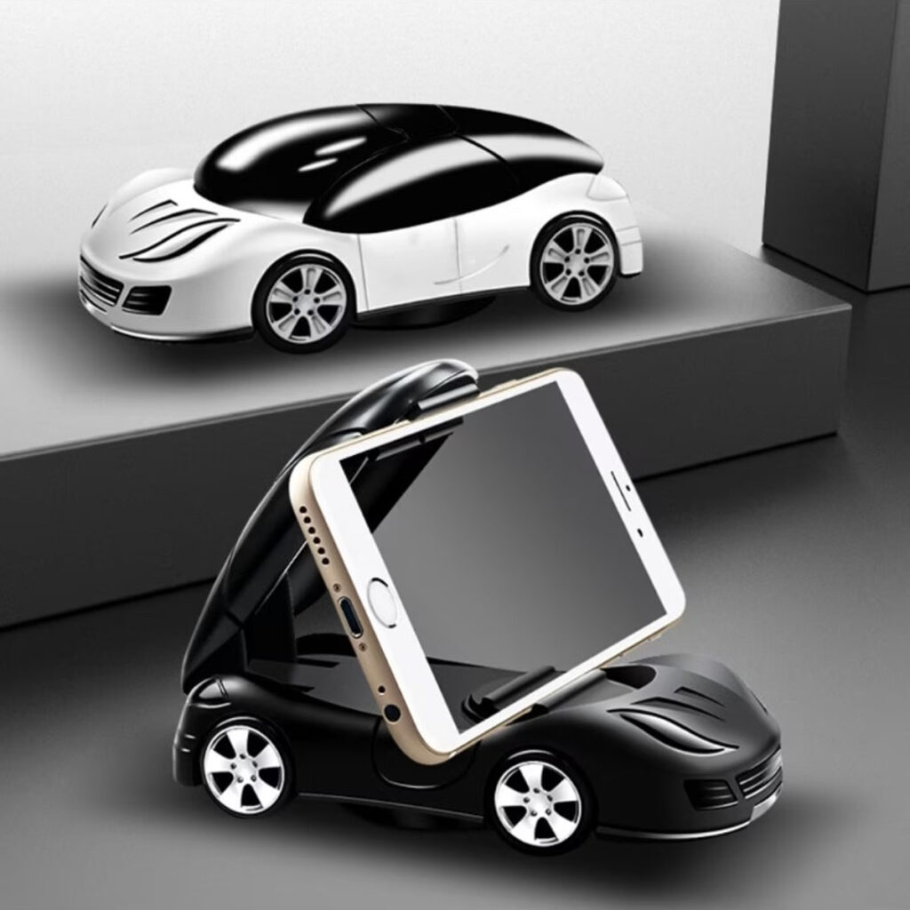
Drehbarer Auto Handyhalter „Sportwagen“
Ausführung wählen
Dieses Produkt weist mehrere Varianten auf. Die Optionen können auf der Produktseite gewählt werden
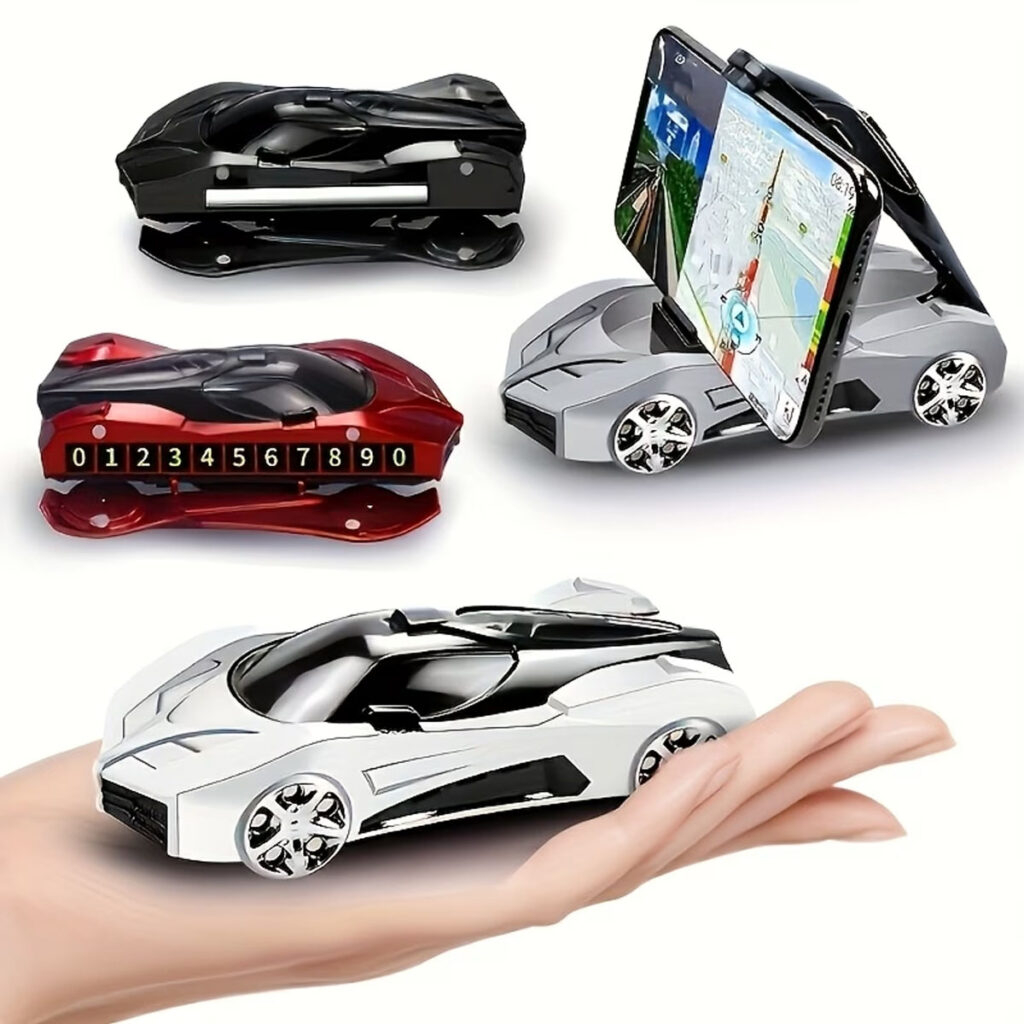
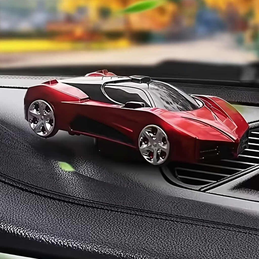
Drehbarer Auto Handyhalter „Super Sportwagen“
Ausführung wählen
Dieses Produkt weist mehrere Varianten auf. Die Optionen können auf der Produktseite gewählt werden